The Chicago Data Visualization Group teamed up with the American Evaluation Association’s Data Visualization special interest group for a joint meetup. It was a tremendous pleasure and very fun to team-up with Stephanie Evergreen and Kate Livingston to work on the meetup. In particular, we were able to derive a Data Visualization Pictionary game.
Below are the rules and some example outcomes
Teams:
Split group into teams– ideally teams of 3-6 people so all have a chance to draw.
Each team has 2 mins to come up with data viz related team name.
Rules:
It’s more fun if everyone gets a chance (or is forced) to draw; each team needs to choose what order they will draw in (assign each person a number);
When it’s your turn to draw, come up to the drawing board and the game masters will give you your card;
Cards are in the following categories: people, objects, “visualize this”, and difficult;
People – data visualization experts and practitioners
Objects – types of graphs
“Visualize this” category requires you to create a visualization based on the phrase. Drawers may use one label on the graph to provide a hint.
Difficult – a miscellaneous category of difficult topics, graphs
Game masters will announce the category out loud to everyone, but only the drawer will get to see the card;
The drawer will have 15 seconds to look at and take in their clue;
The drawer can choose to pass, in which case the game masters will give them a different card; if a drawer does pass, their team loses a point; it’s best to try to draw what’s on your card, even if you don’t know what it is or what it means; you never know, your team may guess it;
The person drawing will have 60 seconds to draw what’s on the card; only their own team mates are allowed to guess during that time; teammates can just should out anything that comes to mind; the game masters will decide if they get it or if it’s close enough within the allotted 60 seconds to award the team a point.;
The person drawing may not use gestures, words, hand signals, head nods, or any other signs to indicate if their team is on the right track or not;
The person drawing may not include letters or numbers in their drawing;
At the end of 60 seconds, if the team has not correctly guessed the card other teams will have a chance to guess; game masters will ask teams in order of which team is next until either one of the teams guesses correctly or until each team has had a guess and all were wrong; if a team guesses correctly, they get a point;
The next team, determined by the game master’s order, has a drawer come up and the process starts again;
Game play continues until one team has 5 points
The team name that game masters like the best is the team that draws first; the other teams are in a random order decided by the game masters.
First team has drawer come up and game begins.
Game masters keep score, remind teams of order, and decide on ‘close’ guesses and points awarded.
Game play continues until a team gets 5 points.
Examples
People
Graph Types
Visualize This
Difficult
Edward Tufte
Bar Chart
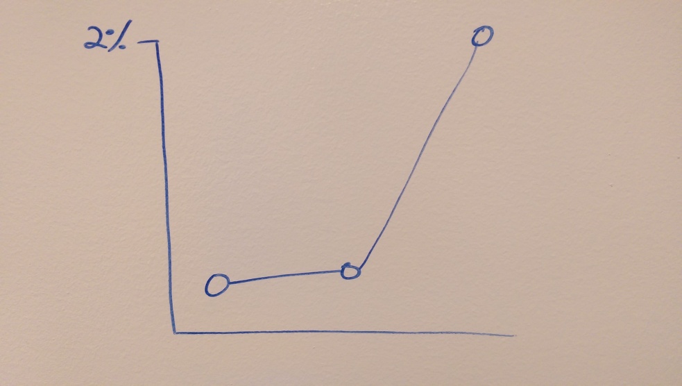
Time series of Bobby Jindal’s poll numbers
Slope Graph
Stephanie Evergreen
Dot plot
Correlation of temperature and happiness
Voronoi map
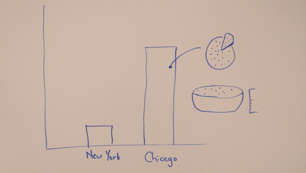
Data Viz Pictionary Challenge: The quality of Chicago’s pizza versus New York
The different categories have their own challenge: the ability to characterize notable data visualization authors or just simply remember how to draw particular graphs. But, perhaps most fun, is to visualize a phrase: above, the relative quality of Chicago deep dish pizza to New York’s style. Below, an visualization of Bobby Jindal’s poll numbers.
You probably heard that IEEE VIS 2015 is being hosted in Chicago this year. It’s one of the largest, premiere data visualization events in the world.
So we’re very excited to announce that Chicago Data Visualization Members will be able to attend some jointly-hosted meetup events during IEEE VIS 2015. CDVG, University of Illinois at Chicago’s Electronic Visualization Laboratory, and the IEEE BioVis special interest group will be holding a joint meetup looking at biology and bioinformatics data visualization on Tuesday, October 17 at 12:30pm. The event will be held at Palmer House Hilton in Salon B. You must register for the meetup to attend.
You are also invited to the VIS Arts Program (VISAP), which showcases innovative artwork and research that explores the increasingly prominent intersections between art and visualization. The opening of VISAP will take place at 7:00pm on October 27th at the LeRoy Neiman Center at the School of the Art Institute. Registration is available for the event through the end of October 26th (central time).
Please register for these events as there is limited attendance and will require mandatory registration.
Time for a graphic makeover just in time for a number of events this fall. We have some exiting events coming up in October and November this year. Details are being finalized, but Chicago Data Visualization Group members will have a pair of excellent opportunities to participate in select IEEE VIS 2015 events that are being held in Chicago. Likewise, the American Evaluation Association 2015 conference is being held in November and we’re planning some fun cross-programming. Details of these events will be announced in the upcoming weeks.
Invites for the upcoming events will be coming up once details are finalized.
Looking back, 2014 was a great year for data visualization in Chicago and our group. The group met 10 times this past year in a mix of workshop and seminars. Group membership grew from 700 to 1,400 members over the year. I wanted to review what we did last year, where we excelled and where we fell short. Even though it was a wonderful year for the group, 2015 is an opportunity to grow and offer even more to those interested in data visualization in the Chicagoland area.
City of Big Data
Given my role in Chicago’s government, the city (the entity of residents, companies, and culture; not just the government) tended to be showcased. The City of Big Data exhibit at the Chicago Architecture Foundation was a grand exhibit of the intersection of urban spaces, data visualization, and data. Computer-based 2-D and 3-D models were featured, and a real-life 3-D projection of data onto a scale replica of downtown Chicago.
Chicago: City of Big Data
The organizers of the exhibit were exploring how data is not a spreadsheet or abstract notion, instead, it surrounds us. Some of this data is public, highlighted by its display on the 3D model. But it’s also private, captured by Facebook activity and streaming music. In all, it surrounds us in the same way it does in the exhibit.
Data Science for Social Good is a relatively new program that puts highly-qualified and trained undergraduate, graduate, and post-graduate students in Chicago working on research problems to improve society. Many of these fellows were part of the group over the year. This fall, we were able to see some of those projects which are mostly available as open source projects.
It was obvious that Shiny was a popular tool to quickly prototype and build interactive programs and maps for end users. Grand visualizations were not a primary outcome of those projects, but because of the operational nature of these systems, clear, concise visualizations and maps were rolled out. While visualization is often associated with impressive, large displays, some of the most crucial visualizations follow good practices on charts and maps, enabling exploration through advance filtering. While grand visualizations are the most impressive, the most important visualizations are well-executed visualization of maps and simple graphs.
Importance in design
One of my favorite meetup concepts in 2014 was exploring how design choices leads to a different user experience. This past April, Heather Billings of Chicago Tribune and Derek Eder and Erik Van Zanten of DataMade shared how they visualized the crime data located on the City’s open data portal. It’s a popular dataset from the number of rows (over 5 million) and the pertinent nature of the topic. There seems to be hundreds of analysis and graphs of the data, but the dataset is only 22 variables (columns)–how can the same data look so different?
Each one of the designers took a different approach to visualizing crime data. Chicago Tribune focused on crime in the neighborhood. Derek was candide in admitting that the project was an exploration and learning project as an intentional visualization. Erik demonstrated a tool that allowed people to define their own area of interest. Each project used the exact same data source, but the design and visualization choice led to different user experiences and outcomes.
The city is often the subject of research, an easy topic since it’s a topic that literally surrounds us every day. The newly launched bike-share program led to the DIVVY Data Challenge was quite successful. Similar to crime data, there were a number of drastically different designs based on the same fundamental data, so how different of a design and experience yields from the same data? In this case, there were 99 submissions, all with their own design.
Viva Voronoi!
We looked at Divvy Spokes, a chord diagram showing neighborhood-to-neighborhood connections by Shaun Jacobsen; thorough statistical analysis by Drew DePriest on ride patterns and his struggle with seemingly messy data; custom dashboard (with crossfiltering!) by Michael Freeman; and learned Voronoi tiles from Gabe Gaster on his map. Additional “show and tell” presentations by KK shows the usefulness and ease of Tableau and–in one of the most amusing apps–find your match on DIVVY with Serendivvity. The same dataset was literally ranging from a dashboard to a dating site. Ultimately, the design and visualization choices leads to an entirely different experience.
Keynotes
We were treated to nationally renowned data visualization experts. Alberto Cairo previewed his upcoming book and his perspective on the role and epistemology of data visualization. Kaiser Fung, the embodiment of an art critic turned data visualization aficionado, reviewed the best and worst charts–and what makes a good chart, good. Both Alberto and Kaiser, leading speakers in this area, were able to cap off a productive year with outstanding talks.
Review of 2014 goals
Early in 2014, I noted three ways to facilitate a robust meetup group: (1) seminars, (2) teach & learn (workshops), and (3) show & tell. Seminars were a strong part of the year. Visits by Alberto Cairo and Kaiser Fung were enlightening. Generally, we were able to hear from a speaker almost every month. Seminars are a clear staple of this group and will continue to be in the future.
D3 Workshop at Critical Mass
The show & tell sessions were also repeated throughout the year. The DIVVY meetup was particularly wonderful as some great data visualizations were presented during very short presentations. It was successful enough this year where I aim to deliver more of these opportunities in the future.
Sadly, this puttered out throughout the year and I do not think we achieved our mission of providing workshops and conducting adequate hands-on training. We started strong with workshops on D3 (many thanks to Paul Katsen for a wonderful job!), but scheduling started to interfere. We are going to renew our efforts to offer workshops in 2015.
Looking forward to 2015
We will continue to offer the three areas of focus–seminars, workshops, and show & tell–from 2014. I hope to improve the number of workshops that can be provided to the Chicago community. But, in addition, we will take the opportunity to improve upon the past year. Thus, the next year will include new focuses that weren’t covered in 2014.
Data visualization is frequently embodied by business intelligence tools, used by large and small organizations. We will be spending some time this year focusing on business intelligence platforms. There is an unfortunate vacuum in the Chicago community around BI platform awareness.
Our first meetup (TBA) will discuss the Tableau platform. As we learned from the Data Science for Social Good group, some of the best data visualization is good execution of basic graphs. The rise of “data exploration” platforms have focused more on visualization and discovery than automating or “pixel-perfect” reports. We will introduce these platforms and discuss the pros and cons of these tools.
Data visualization is also establishing itself as a profession. Dedicated data visualization-ists(?) are being sought on job boards. Thus, we will be more considerate on making a connection between employers and potential employees. Late in the year, we introduced an opportunity for employers to note they were hiring. We will continue that practice. Likewise, we will increase the offerings for serious professional development in the group.
These lists are never exhaustive, but is a start of a plan for 2015. I am interested to hear your feedback through this blog, @ChicagoDataVis, chicagodataviz@gmail,com, and at the events.
Unfortunately, due to last minute scheduling issues, we will be postponing the D3 workshop planned for Thursday, April 3rd. We hope to reschedule this meetup soon and we apologize for the inconvenience.
Josh Doyle has done a remarkable job at establishing the Chicago Data Visualization Group in the city. Just a couple of years ago, noticing a gap in Chicago’s active peer network, he rightly identified a larger interest in data visualization. As he noted, Josh will be active in the community but I will be stepping-in to organize the group’s meetups. I am very excited that I have an opportunity to spend a little time working with this group. In large part, I am relieved that Josh has done the hard work of keeping a new group active in it’s initial stage. In the upcoming year, I have the luxury of building upon previous work.
What will that work entail? Namely, I want to increase the number of opportunities for members through the meetup group. We’ve begun scheduling a pair of events each month; a workshop early in the month and a seminar or presentation at the end. It would be ideal to keep this pace throughout the year, if not more.
There is a general approach to upcoming events. In addition to increasing frequency, I hope this group can provide a rich variety of meetups in these areas:
Show & Tell
Chicago’s local talent has produced superb visualization, many of which feature Chicago itself. Companies like Datascope Analytics, Datamade, Chicago Tribune, and others actively use data visualization as a means of effective communication. To further the local community–our community–I hope we can share work through a show and tell for every meetup.
This was introduced as “lightning talks” in the most recent meetup, but will continue to exist as a show & tell.In addition to showing completed works, I hope members will be brave enough where work-in-progress can be shared to solicit feedback in the development process.Want to give a show & tell? Bring a laptop (and dongle) that can connect to a VGA cable and be prepared to talk. For now, we’ll keep the lightning talk format to a 5-minute limit.
Teach & Learn Data visualization is a profession that involves skill and toolset. We are fortunate that many of us work in a growing software development, UI/UX, data analytics, and general IT fields. But it also leaves limited opportunity to learn in a rapidly changing field. This year we will be offering a series of free workshops on various data visualization tools. Paul Katsen has held the well-received D3 workshops.
In the upcoming year, we aim to expand to other tools, including R and more D3. We also would like for you to lead sessions. With over 800 members in our group alone, there is sufficient talent that could be taught to others from our own ranks. Always feel free to reach out with a new idea for a workshop that can be useful for budding and experienced data visualization-ists.
Seminars We already have had great speakers, such as Andy and Cole, visit us in Chicago. I hope to bring more leaders in visualization to our meetups. There are some exciting speakers that are being confirmed for later this year.Local talent is also important. Chicago-based Datascope Analytics have presented to our group, as will Datamade, Chicago Tribune, and a variety of people who participated in the DIVVY Data Challenge.
In May, we will be holding an event at the Chicago Architecture Foundation’s City of Big Data exhibit. I hope we can continue to feature data visualization from our own community as featured seminars.
This isn’t an exhaustive list, but a start to a good year. I am interested to hear your feedback through this blog, @ChicagoDataViz, chicagodataviz@gmail,com, and at the events.
Thanks to the 30+ CDVG members that came out to the first night of the Graphing in R & ggplot2 workshop at 1871. It was a great start and I look forward to doing more of these in the future. I’ve updated the presentation and posted it to slideshare. Here is a highlight of the changes:
added link to a matrix multiplication tutorial on the Matrix: Arithmetic slide (p. 26).
changed the data frame subsetting example to access columns by name instead of index number.
cleaned up typos.
added references page.
Free copy of the R Cookbook for the first person to post and share a valid solution to any one of the exercises on slide number 36. You can post on your own blog, on our CDVG blog (contact me) or Github(recommended). just let us know where you put it.
Another reminder that we don’t have the IMSA classroom on October 22 and we will either push the schedule a week or just meet in the shared areas of 1871. We will make that decision before leaving 1871 this coming Monday.
I look forward to seeing everyone next week when we will start using ggplot2 under the tutelage of Tom Schenk. Bring $5 if you want to have pizza that night. Drinks are BYO. I’ll bring a few extra beers for anyone that wants to do a beer swap. It’s a great way to discover something new to drink.


